library(ggbreak)
library(gsheet)
library(readxl)
library(ggtext)
library(tidyverse)
library(ggthemes)
library(grid)
library(gridExtra)
library(patchwork)
library(car)
library(rms)
library(scales)
library(caret)
# tidyfun is currently not on CRAN. You can install the development version from GitHub with:
# # install.packages("pak")
#pak::pak("tidyfun/tidyfun")
library(tidyfun)
# Kaique dos S. Alves modifications to the geom-spaghetti function (updated ggplot linewidth instead of size):
source(here::here("geom-spaghetti.R"))Figures
Here is the code for all figures of the paper.
Libraries:
Geom-spaghetti.R source: https://doi.org/10.17605/OSF.IO/V53PY
Data
data <- read_xlsx("plan/weather_data_final.xlsx")
data_nasa <- read_csv("plan/weather_data_nasa.csv")

data <- data %>%
  filter(!study %in% 126:150)

data_nasa <- data_nasa %>%
  filter(!study %in% 126:150)
Figure 1:
itp.curves <- function(data, variable, sig_days = NULL, .ylab = NULL) {
  var_sym <- rlang::enquo(variable)

  p <- suppressMessages(
    data %>%
      dplyr::select(study, days, epidemic, !!var_sym) %>%
      tf_nest(!!var_sym, .id = study, .arg = days) %>%
      dplyr::group_by(epidemic) %>%
      dplyr::summarize(var_mean = mean(!!var_sym)) %>%
      dplyr::mutate(smooth_mean = tfb(var_mean)) %>%
      ggplot(aes(tf = smooth_mean, color = factor(epidemic))) +
      geom_spaghetti(linewidth = 2, alpha = 1) +
      scale_x_continuous(breaks = seq(-28, 28, by = 4)) +
      geom_vline(xintercept = 0, color = "gray", linetype = "dashed") +
      ggthemes::scale_color_excel_new(labels = c("Non-epidemic", "Epidemic")) +
      theme_bw() +
      labs(x = "Days relative to event",
           y = .ylab,
           color = "Epidemic status") +
      theme(axis.title.y = element_text(size = 12),
            axis.title.x = element_text(size = 12),
            axis.text.x = element_text(size = 9),
            axis.text.y = element_text(size = 9),
            legend.position = "bottom")
  )

# Add shading for significant days
  if (!is.null(sig_days)) {
    for (d in sig_days) {
      p <- p + annotate("rect", xmin = d - 0.5, xmax = d + 0.5, ymin = -Inf, ymax = Inf,
                        fill = "gray40", alpha = 0.3)
    }
  }

  return(p)
}
itp_rh <- c(5, 6, 7, 8, 9, 10)
rh_curves <- itp.curves(data, RH2M, sig_days = itp_rh, .ylab = "Relative humidity (%)")itp_tmin <- 2:10
tmin_curves <- itp.curves(data, T2M_MIN, sig_days = itp_tmin, .ylab = "Min Temperature (°C)")itp_tdew <- 4:10
tdew_curves <- itp.curves(data_nasa, T2MDEW, sig_days = itp_tdew, .ylab = "Dew point (°C)")itp_prec <- 6:10
prec_curves <- itp.curves(data_nasa, PRECTOTCORR, sig_days = itp_prec, .ylab = "Precipitation (mm)")boxplots
df_predictors <- read_xlsx("plan/df_predictors.xlsx")p_tmin1 <- df_predictors |>
ggplot(aes(factor(epidemic), tmin, color = factor(epidemic))) +
geom_boxplot(fill = NA, linewidth = 0.9) +
labs(y = "Tmin<sub>2_10</sub> (°C)", x = "Epidemic") +
ggthemes::scale_color_excel_new(labels = c("Non-epidemic", "Epidemic")) +
theme_bw()+
theme(
axis.title.y = element_text(size = 12),
axis.title.x = element_text(size = 12),
legend.position = "none",
axis.text.x = element_text(size = 9),
axis.text.y = element_text(size = 9)
)
p_dew1 <- df_predictors |>
ggplot(aes(factor(epidemic), dew, color = factor(epidemic)))+
geom_boxplot(fill = NA, linewidth = 0.9) +
labs(y = "Tdew<sub>4_10</sub> (°C)", x = "Epidemic")+
ggthemes::scale_color_excel_new(labels = c("Non-epidemic", "Epidemic")) +
theme_bw()+
theme(
axis.title.y = element_text(size = 12),
axis.title.x = element_text(size = 12),
legend.position = "none",
axis.text.x = element_text(size = 9),
axis.text.y = element_text(size = 9)
)
p_rh1 <- df_predictors |>
ggplot(aes(factor(epidemic), rh, color = factor(epidemic)))+
geom_boxplot(fill = NA, linewidth = 0.9)+
labs(x = "Epidemic", y = "RH<sub>5_10</sub> (%)")+
ggthemes::scale_color_excel_new(labels = c("Non-epidemic", "Epidemic")) +
theme_bw()+
theme(
axis.title.y = element_text(size = 12),
axis.title.x = element_text(size = 12),
legend.position = "none",
axis.text.x = element_text(size = 9),
axis.text.y = element_text(size = 9)
)
p_prec1 <- df_predictors |>
ggplot(aes(factor(epidemic), prec2, color = factor(epidemic)))+
geom_boxplot(fill = NA, linewidth = 0.9)+
ggthemes::scale_color_excel_new(labels = c("Non-epidemic", "Epidemic")) +
theme_bw()+
labs(x = "Epidemic", y = "PREC<sub>6_10</sub> (mm)")+
theme(
axis.title.y = element_text(size = 12),
axis.title.x = element_text(size = 12),
legend.position = "none",
axis.text.x = element_text(size = 9),
axis.text.y = element_text(size = 9)
)(tmin_curves | p_tmin1) /
(rh_curves | p_rh1) /
(tdew_curves | p_dew1) /
(prec_curves | p_prec1) +
plot_layout(guides = "collect") &
theme(legend.position = "bottom") &
plot_annotation(tag_levels = "A")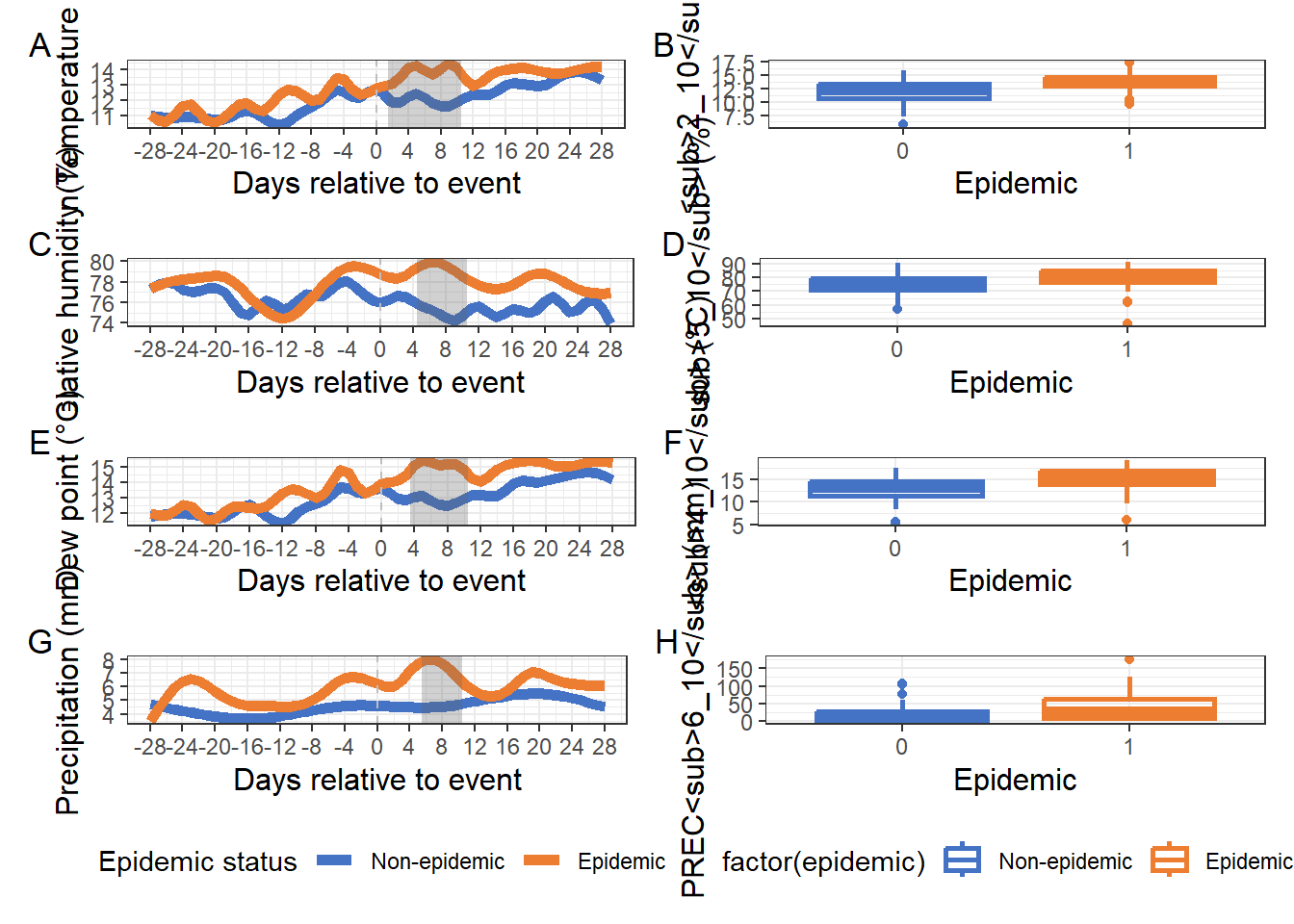
Figure 2:
models <- list(
  model1 = lrm(factor(epidemic) ~ tmin + rcs(rh, 4), data = df_predictors, x = TRUE, y = TRUE),
  model2 = lrm(factor(epidemic) ~ rcs(rh, 4) + rcs(dew, 3), data = df_predictors, x = TRUE, y = TRUE),
  model3 = lrm(factor(epidemic) ~ tmin + prec2, data = df_predictors, x = TRUE, y = TRUE)
)

# Predicted probabilities
p1 <- predict(models$model1, type = "fitted")
p2 <- predict(models$model2, type = "fitted")
p3 <- predict(models$model3, type = "fitted")

# Real
actual <- df_predictors$epidemic

# # Ensembles
ensemble_unw   <- (p1 + p2 + p3) / 3
stack_data     <- data.frame(p1 = p1, p2 = p2, p3 = p3, epidemic = factor(df_predictors$epidemic))
meta_model     <- glm(epidemic ~ p1 + p2 + p3, data = stack_data, family = binomial)
ensemble_stack <- predict(meta_model, type = "response")
# Hard vote
# Cut-points para classificação binária
cut_p1 <- 0.530
cut_p2 <- 0.51
cut_p3 <- 0.460
# Classificações binárias
class_p1 <- ifelse(p1 >= cut_p1, 1, 0)
class_p2 <- ifelse(p2 >= cut_p2, 1, 0)
class_p3 <- ifelse(p3 >= cut_p3, 1, 0)
# Função votação majoritária
hard_vote <- function(...) {
votes <- c(...)
if (sum(votes) >= ceiling(length(votes)/2)) {
return(1)
} else {
return(0)
}
}
# Aplica a votação majoritária para cada observação
ensemble_hard <- mapply(hard_vote, class_p1, class_p2, class_p3)#-----------------------------------------------------
# Function to compute evaluation metrics for a model
#-----------------------------------------------------
evaluate_model <- function(probs, threshold = 0.5, name = "model", type = "base") {
pred <- ifelse(probs >= threshold, 1, 0)
cm <- confusionMatrix(factor(pred), reference = as.factor(actual), positive = "1")
data.frame(
Model = name,
Type = type,
Accuracy = cm$overall["Accuracy"],
Sensitivity = cm$byClass["Sensitivity"],
Specificity = cm$byClass["Specificity"]
)
}
#-------------------------------------------------
# Evaluate all models and bind into a single table
#-------------------------------------------------
eval_df <- rbind(
evaluate_model(p1, 0.53, "LM1", "Base"),
evaluate_model(p2, 0.51, "LM2", "Base"),
evaluate_model(p3, 0.46, "LM3", "Base"),
evaluate_model(ensemble_unw, 0.475, "UNW", "Ensemble"),
evaluate_model(ensemble_hard, 0.5, "HRD", "Ensemble"),
evaluate_model(ensemble_stack, 0.47, "STACK", "Ensemble")
)
# Add Youden index to eval_df and sort
eval_df$Youden <- with(eval_df, Sensitivity + Specificity - 1)
# Factor Model by sorted order for consistent legend
eval_df$Model <- factor(eval_df$Model, levels = eval_df$Model)
eval_df <- eval_df %>%
mutate(
ROC_AUC = case_when(
Model == "LM1" ~ 0.798,
Model == "LM2" ~ 0.792,
Model == "LM3" ~ 0.814,
Model == "UNW" ~ 0.842,
Model == "HRD" ~ 0.811,
Model == "STACK"~ 0.826
),
PR_AUC = case_when(
Model == "LM1" ~ 0.742,
Model == "LM2" ~ 0.754,
Model == "LM3" ~ 0.720,
Model == "UNW" ~ 0.796,
Model == "HRD" ~ 0.758,
Model == "STACK"~ 0.784
))
# View table
print(eval_df) Model Type Accuracy Sensitivity Specificity Youden ROC_AUC
Accuracy LM1 Base 0.776 0.64 0.8666667 0.5066667 0.798
Accuracy1 LM2 Base 0.792 0.64 0.8933333 0.5333333 0.792
Accuracy2 LM3 Base 0.800 0.74 0.8400000 0.5800000 0.814
Accuracy3 UNW Ensemble 0.800 0.70 0.8666667 0.5666667 0.842
Accuracy4 HRD Ensemble 0.816 0.72 0.8800000 0.6000000 0.811
Accuracy5 STACK Ensemble 0.824 0.74 0.8800000 0.6200000 0.826
PR_AUC
Accuracy 0.742
Accuracy1 0.754
Accuracy2 0.720
Accuracy3 0.796
Accuracy4 0.758
Accuracy5 0.784a <- ggplot(eval_df, aes(x = Accuracy, y = Youden, color = Model, shape = Type)) +
geom_point(alpha = 0.8, size = 6) +
scale_shape_manual(values = c(Base = 16, Ensemble = 17)) +
ggthemes::scale_color_excel_new() +
labs(x = "Accuracy", y = "Youden index", size = "AUC") +
theme_bw() +
xlim(0.75, 0.85) +
ylim(0.5, 0.7) +
theme(plot.title = element_text(size = 16, hjust = 0.5),
axis.title.x = element_text(size = 14),
axis.title.y = element_text(size = 14),
legend.position = "bottom") +
guides(color = guide_legend(nrow = 1), shape = "none") +
scale_size_continuous(
limits = c(0.79, 0.835),
range = c(2, 8),
breaks = c(0.80, 0.81, 0.82, 0.83),
labels = scales::number_format(accuracy = 0.01)
)
b <- ggplot(eval_df, aes(x = Sensitivity , y = Specificity, color = Model, shape = Type)) +
geom_point(alpha = 0.8, size = 6) +
ggthemes::scale_color_excel_new() +
labs(x = "Sensitivity", y = "Specificity", size = "AUC") +
theme_bw() +
xlim(0.6, 0.8) +
ylim(0.825, 0.90) +
theme(plot.title = element_text(size = 16, hjust = 0.5),
axis.title.x = element_text(size = 14),
axis.title.y = element_text(size = 14),
legend.position = "bottom") +
guides(color = guide_legend(nrow = 1), shape = "none") +
scale_size_continuous(
limits = c(0.79, 0.835),
range = c(2, 8),
breaks = c(0.80, 0.81, 0.82, 0.83),
labels = scales::number_format(accuracy = 0.01)
)
c <- ggplot(eval_df, aes(x = ROC_AUC, y = PR_AUC, color = Model, shape = Type)) +
geom_point(alpha = 0.8, size = 6) +
scale_shape_manual(values = c(Base = 16, Ensemble = 17)) +
ggthemes::scale_color_excel_new() +
labs(x = "ROC_AUC", y = "PR_AUC") +
theme_bw() +
xlim(0.775, 0.85) +
ylim(0.715, 0.80) +
theme(plot.title = element_text(size = 16, hjust = 0.5),
axis.title.x = element_text(size = 14),
axis.title.y = element_text(size = 14),
legend.position = "bottom") +
guides(color = guide_legend(nrow = 1), shape = "none") +
scale_size_continuous(
limits = c(0.79, 0.835),
range = c(2, 8),
breaks = c(0.80, 0.81, 0.82, 0.83),
labels = scales::number_format(accuracy = 0.01)
)
(a/b/c) +
plot_layout(guides = "collect") &
plot_annotation(tag_levels = "A")&
theme(legend.position = "bottom")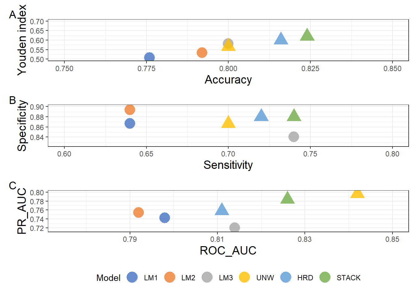
Figure 3:
res <- read.csv("plan/res.csv")

pA <- ggplot(res, aes(pt, NMB_mean)) +
  geom_ribbon(aes(ymin = NMB_lo, ymax = NMB_hi), alpha = 0.15, fill = "#4970b5") +
  geom_line(size = 1.5, color = "#ED7D31") +
  geom_hline(yintercept = 0, linetype = 2, color = "gray60") +
  labs(x = expression("Risk threshold (" * italic(p)[italic(t)] * ")"),
    y = expression("Mean NMB (USD/ha per decision unit)")) +
  theme_bw()+
  theme(
    axis.title.y = element_text(size = 14),
    axis.title.x = element_text(size = 14),
    axis.text.x = element_text(size = 10),
    axis.text.y = element_text(size = 10)
  )+
    scale_y_continuous(breaks = breaks_width(10.0))


pB <- ggplot(res, aes(pt, Pr_trat_pos)) +
  annotate("rect", ymin = 0.5, ymax = 0.8, xmin = -Inf, xmax = Inf,
                        fill = "#4970b5", alpha = 0.2)+
  geom_line(size = 1.5, , color = "#ED7D31") +
  geom_hline(yintercept = 0.5, linetype = 2, color = "gray60") +
  geom_hline(yintercept = 0.8, linetype = 2, color = "gray60") +
  scale_y_continuous(labels = scales::percent_format(accuracy = 1), limits = c(0,1)) +
  labs(x = expression("Risk threshold (" * italic(p)[italic(t)] * ")"),
       y = "Probability of NMB > 0") +
  theme_bw()+
  theme(
    axis.title.y = element_text(size = 14),
    axis.title.x = element_text(size = 14),
    axis.text.x = element_text(size = 10),
    axis.text.y = element_text(size = 10)
  )

pD1 <- ggplot(res, aes(pt, NMB_trat_mean)) +
    geom_ribbon(aes(ymin = NMB_trat_lo, ymax = NMB_trat_hi), alpha = 0.15, fill = "#4970b5") +
  geom_line(size = 1.5, color = "#ED7D31") +
  geom_hline(yintercept = 0, linetype = 2, color = "gray60") +
  labs(x = expression("Risk threshold (" * italic(p)[italic(t)] * ")"),
       y = "NMB per treated unit (USD/ha)") +
  theme_bw()+
  theme(
    axis.title.y = element_text(size = 14),
    axis.title.x = element_text(size = 14),
    axis.text.x = element_text(size = 10),
    axis.text.y = element_text(size = 10)
  )

pD2 <- ggplot(res, aes(pt, PPV)) +
  geom_ribbon(aes(ymin = PPV_req_lo, ymax = PPV_req_hi), alpha = 0.15, fill = "#4970b5") +
  geom_line(size = 1.5, color = "#ED7D31") +
  geom_line(aes(y = PPV_req_med), linetype = 2, color = "gray60") +
  scale_y_continuous(limits = c(0,1), labels = scales::percent) +
  labs(x = expression("Risk threshold (" * italic(p)[italic(t)] * ")"),
       y = "Observed PPV vs. required PPV (C/B)") +
  theme_bw()+
  theme(
    axis.title.y = element_text(size = 14),
    axis.title.x = element_text(size = 14),
    axis.text.x = element_text(size = 10),
    axis.text.y = element_text(size = 10)
  )

(pD1 | pB)/
(pA | pD2)+
      plot_annotation(tag_levels = "A")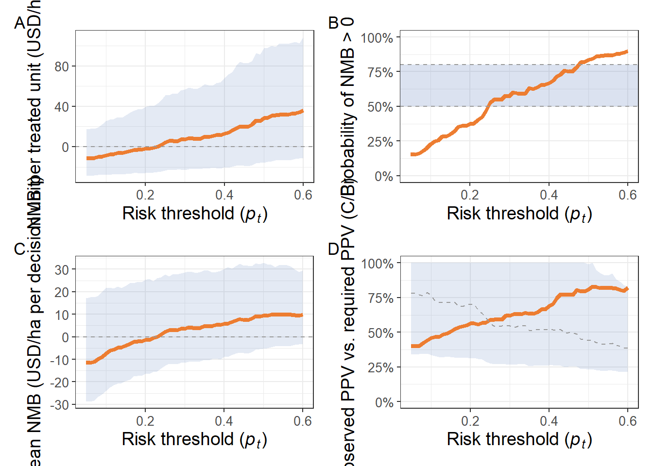
# Pega os dois pontos ao redor de 0.5
below <- res %>% filter(Pr_trat_pos < 0.8) %>% slice_tail(n = 1)
above <- res %>% filter(Pr_trat_pos >= 0.8) %>% slice_head(n = 1)

# Interpolação linear
pt_50 <- below$pt + (0.5 - below$Pr_trat_pos) / (above$Pr_trat_pos - below$Pr_trat_pos) * (above$pt - below$pt)
pt_50
[1] 0.3925414Figure Supplementar 2:
table <- gsheet2tbl("https://docs.google.com/spreadsheets/d/1MBiKsosQ8Hob6LkS65_1pPU25hx1CO9i42Sm_xf28ww/edit?gid=0#gid=0") |>
  dplyr::select(study, year, location, state, lat, lon, planting_date, cultivar, index, daa_mean, flowering) |>
  filter(study %in% 1:101)
table |>
ggplot(aes(daa_mean, location))+
geom_boxplot(color = "#ed7d31",linewidth = 0.9)+
labs(y = "Trial location", x = "Days to flowering")+
theme_bw()+
theme(
axis.title.y = element_text(size = 12), # enable Markdown in Y-axis label
axis.title.x = element_text(size = 12),
legend.position = "none",
axis.text.x = element_text(size = 9),
axis.text.y = element_text(size = 9)
)+
scale_x_continuous(n.breaks = 6)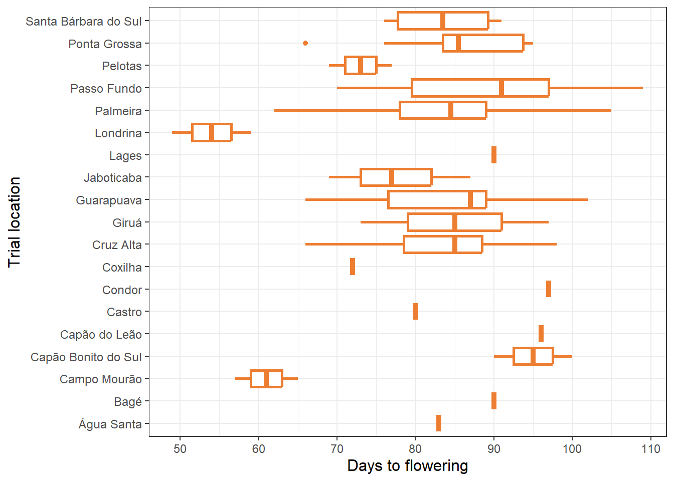
Figure Supplementar 3:
table <- gsheet2tbl("https://docs.google.com/spreadsheets/d/1MBiKsosQ8Hob6LkS65_1pPU25hx1CO9i42Sm_xf28ww/edit?gid=0#gid=0") |>
  dplyr::select(study, year, location, state, lat, lon, planting_date, cultivar, index, daa_mean, flowering) |>
  mutate(epidemic = if_else(index >= 10, 1, 0)) |>
  filter(study %in% 1:125,
         epidemic == 1)

table |>
  ggplot(aes(x = index)) +
  geom_histogram(bins = 15, linewidth = 0.8, alpha = 0.8, position = "identity", color = "#ed7d31", fill = "#ed7d31")+
  labs(x = "FHB severity",
       y = "Count")+
  theme_bw() +
  theme(
    axis.title.y = element_text(size = 12),
    axis.title.x = element_text(size = 12),
    legend.position = "none",
    axis.text.x = element_text(size = 9),
    axis.text.y = element_text(size = 9)
  )+
  scale_y_continuous(labels = number_format(accuracy = 1)) +
  scale_x_continuous(labels = number_format(accuracy = 0.1),
                     breaks = seq(10, 100, 15))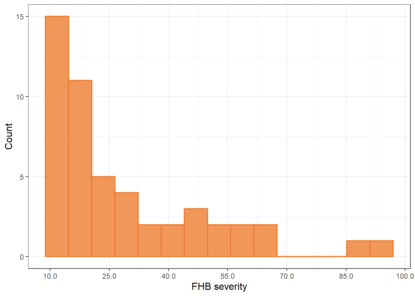
Figure Supplementar 4:
# Set up datadist for rms
dd <- datadist(df_predictors)
options(datadist = "dd")

models <- list(
  model1 = lrm(factor(epidemic) ~ tmin + rcs(rh, 4), data = df_predictors, x = TRUE, y = TRUE),
  model2 = lrm(factor(epidemic) ~ rcs(rh, 4) + rcs(dew, 3), data = df_predictors, x = TRUE, y = TRUE),
  model3 = lrm(factor(epidemic) ~ tmin + prec2, data = df_predictors, x = TRUE, y = TRUE)
)
# Predictive plot
pred_obj <- Predict(models$model1, fun = plogis, conf.int = 0.95)
# Convert to data.frame
pred_df <- as.data.frame(pred_obj)
pred_df_tmin <- pred_df |>
filter(.predictor. == "tmin")
pred_df_rh <- pred_df |>
filter(.predictor. == "rh")
tmin_spline <- ggplot(pred_df_tmin, aes(x = tmin, y = yhat)) +
geom_ribbon(aes(ymin = lower, ymax = upper), alpha = 0.15, fill = "#4970b5") +
geom_line(color = "#ed7d31", linewidth = 1.5) +
labs(x = "Tmin<sub>2_10</sub> (°C)", y = "Predicted Probability") +
theme_bw()+
theme(
axis.title.x = element_text(size = 12), # enable Markdown in Y-axis label
axis.title.y = element_text(size = 12),
axis.text.x = element_text(size = 9),
axis.text.y = element_text(size = 9)
)+
scale_y_continuous(limits = c(0.00, 1.00), breaks = breaks_width(0.25))
rh_spline <- ggplot(pred_df_rh, aes(x = rh, y = yhat)) +
geom_ribbon(aes(ymin = lower, ymax = upper), alpha = 0.15, fill = "#4970b5") +
geom_line(color = "#ed7d31", linewidth = 1.5) +
labs(x = "RH<sub>5_10</sub> (%)", y = "Predicted Probability") +
theme_bw()+
theme(
axis.title.x = element_text(size = 12), # enable Markdown in Y-axis label
axis.title.y = element_text(size = 12),
axis.text.x = element_text(size = 9),
axis.text.y = element_text(size = 9)
)+
scale_y_continuous(limits = c(0.00, 1.00), breaks = breaks_width(0.25))
tmin_spline | rh_spline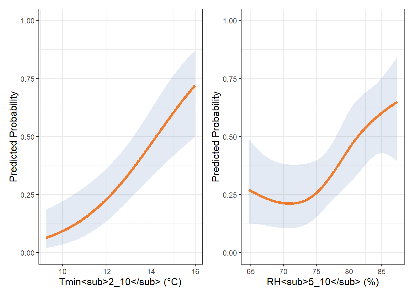
# Predictive plot
pred_obj2 <- Predict(models$model2, fun = plogis, conf.int = 0.95)

# Convert to data.frame
pred_df2 <- as.data.frame(pred_obj2)

pred_df_dew <- pred_df2 |>
  filter(.predictor. == "dew")

pred_df2_rh <- pred_df2 |>
  filter(.predictor. == "rh")


tdew_spline <- ggplot(pred_df_dew, aes(x = dew, y = yhat)) +
  geom_ribbon(aes(ymin = lower, ymax = upper), alpha = 0.15, fill = "#4970b5") +
  geom_line(color = "#ed7d31", linewidth = 1.5) +
  labs(x = "Tdew<sub>4_10</sub> (°C)", y = "Predicted Probability") +
  theme_bw()+
  theme(
    axis.title.x = element_text(size = 12),  # enable Markdown in Y-axis label
    axis.title.y = element_text(size = 12),
    axis.text.x = element_text(size = 9),
    axis.text.y = element_text(size = 9)
  )+
  scale_y_continuous(limits = c(0.00, 1.00), breaks = breaks_width(0.25))


rh2_spline <- ggplot(pred_df2_rh, aes(x = rh, y = yhat)) +
  geom_ribbon(aes(ymin = lower, ymax = upper), alpha = 0.15, fill = "#4970b5") +
  geom_line(color = "#ed7d31", linewidth = 1.5) +
  labs(x = "RH<sub>5_10</sub> (%)", y = "Predicted Probability") +
  theme_bw()+
  theme(
    axis.title.x = element_text(size = 12),  # enable Markdown in Y-axis label
    axis.title.y = element_text(size = 12),
    axis.text.x = element_text(size = 9),
    axis.text.y = element_text(size = 9)
  )+
  scale_y_continuous(limits = c(0.00, 1.00), breaks = breaks_width(0.25))

tdew_spline | rh2_spline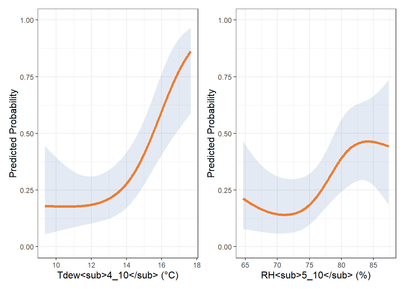
# Predictive plot
pred_obj3 <- Predict(models$model3, fun = plogis, conf.int = 0.95)

# Convert to data.frame
pred_df3 <- as.data.frame(pred_obj3)

pred_df_rain <- pred_df3 |>
  filter(.predictor. == "prec2")

pred_df3_tmin <- pred_df3 |>
  filter(.predictor. == "tmin")

prec_spline <- ggplot(pred_df_rain, aes(x = prec2, y = yhat)) +
  geom_ribbon(aes(ymin = lower, ymax = upper), alpha = 0.15, fill = "#4970b5") +
  geom_line(color = "#ed7d31", size = 1.5) +
  labs(x = "PREC<sub>6_10</sub> (mm)", y = "Predicted Probability") +
  theme_bw()+
  theme(
    axis.title.x = element_text(size = 12),  # enable Markdown in Y-axis label
    axis.title.y = element_text(size = 12),
    axis.text.x = element_text(size = 9),
    axis.text.y = element_text(size = 9)
  )+
  scale_y_continuous(limits = c(0.00, 1.00), breaks = breaks_width(0.25))+
  scale_x_continuous(breaks = pretty_breaks(n = 5))


tmin3_spline <- ggplot(pred_df3_tmin, aes(x = tmin, y = yhat)) +
  geom_ribbon(aes(ymin = lower, ymax = upper), alpha = 0.15, fill = "#4970b5") +
  geom_line(color = "#ed7d31", size = 1.5) +
  labs(x = "Tmin<sub>2_10</sub> (°C)", y = "Predicted Probability") +
  theme_bw()+
  theme(
    axis.title.x = element_text(size = 12),  # enable Markdown in Y-axis label
    axis.title.y = element_text(size = 12),
    axis.text.x = element_text(size = 9),
    axis.text.y = element_text(size = 9)
  )+
  scale_y_continuous(limits = c(0.00, 1.00), breaks = breaks_width(0.25))+
  scale_x_continuous(breaks = pretty_breaks(n = 5))

prec_spline | tmin3_spline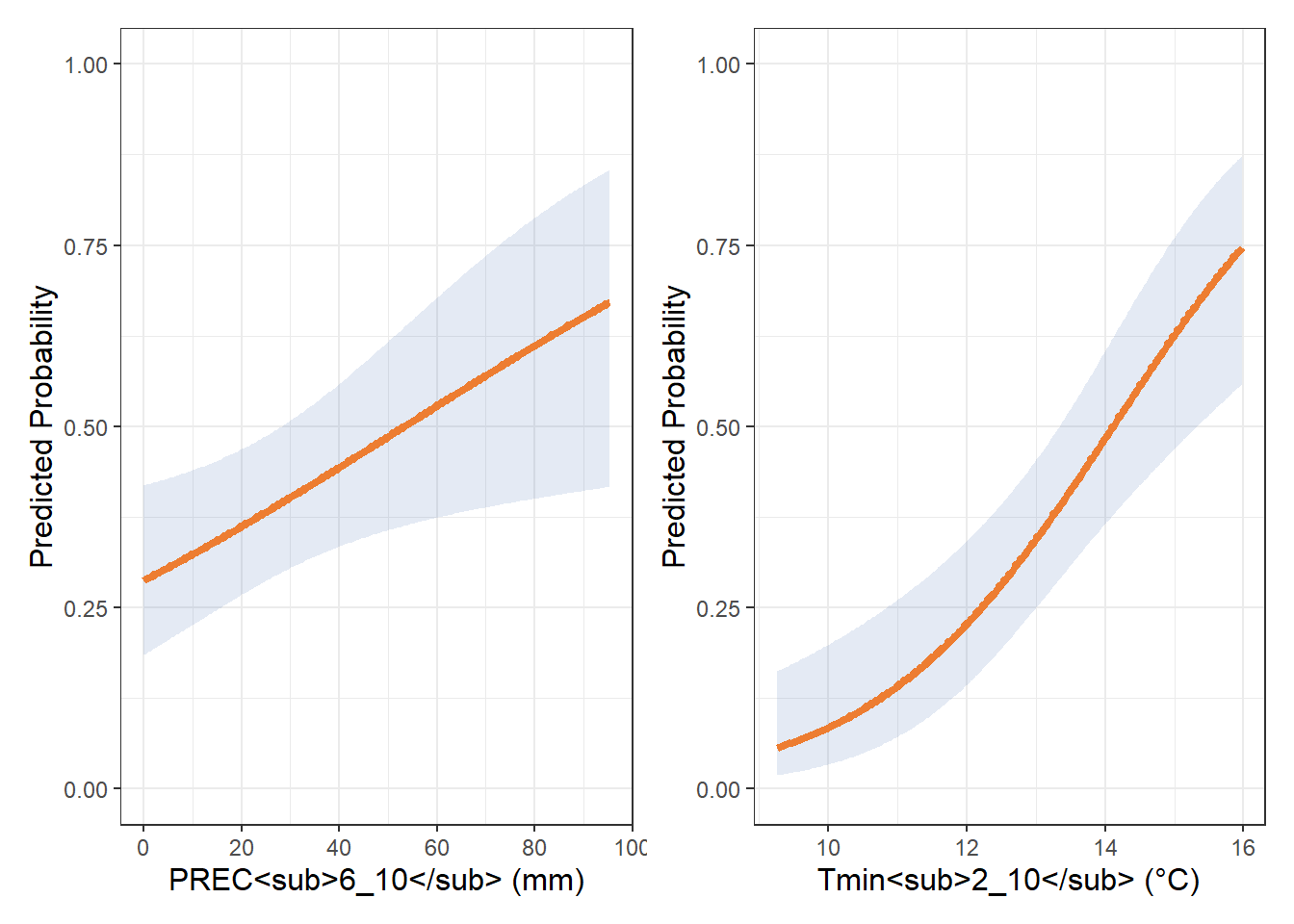
(tmin_spline | rh_spline) /
(rh2_spline | tdew_spline) /
(tmin3_spline | prec_spline) +
  plot_annotation(tag_levels = "A")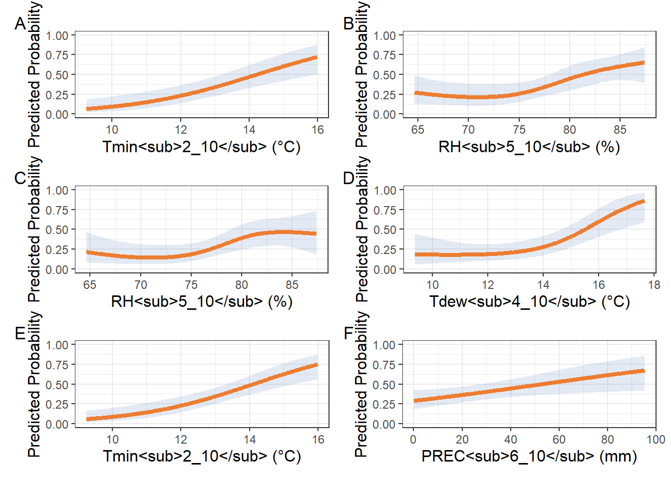
Figure Supplementar 5:
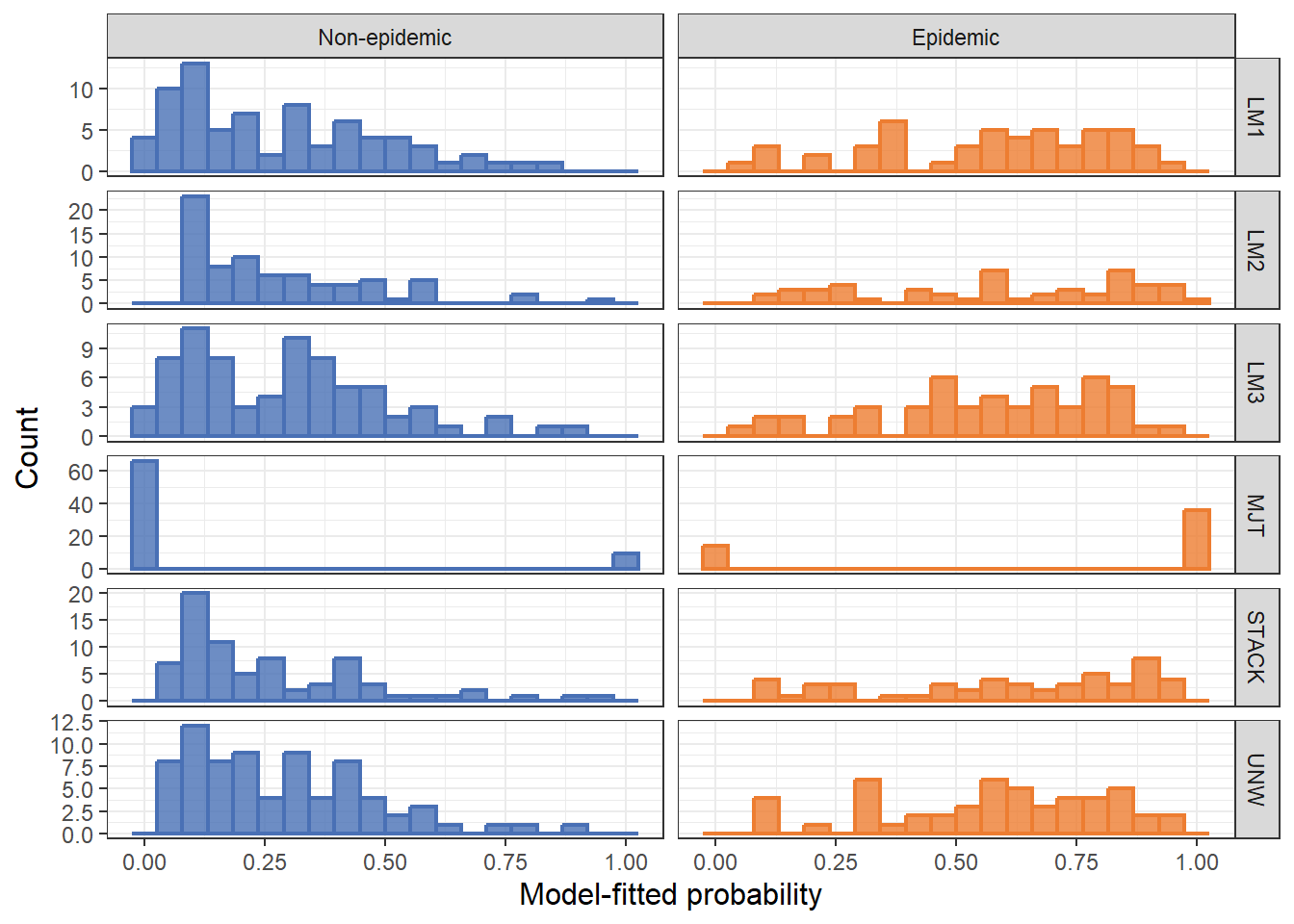
df_preds <- read_xlsx("plan/df_preds.xlsx")

# Put it in long format
df_long <- df_preds %>%
  pivot_longer(
    cols = -epidemic,
    names_to = "model",
    values_to = "prob"
  )

df_long <- df_long %>%
  mutate(epidemic_f = factor(epidemic, levels = c(0, 1),
                             labels = c("Non-epidemic", "Epidemic")))

# Histogram of predicted probabilities
ggplot(df_long, aes(x = prob, fill = factor(epidemic), color = factor(epidemic))) +
  geom_histogram(bins = 20, linewidth = 0.8, alpha = 0.8, position = "identity") +
facet_grid(model ~ epidemic_f, scales = "free_y")+
  labs(x = "Model-fitted probability",
       y = "Count") +
  scale_fill_manual(values = c("0" = "#4970b5", "1" = "#ed7d31"),
                    labels = c("Non-epidemic", "Epidemic")) +
  scale_color_manual(values = c("0" = "#4970b5", "1" = "#ed7d31")) +
  theme_bw() +
  theme(
    axis.title.y = element_text(size = 12),
    axis.title.x = element_text(size = 12),
    legend.position = "none",
    axis.text.x = element_text(size = 9),
    axis.text.y = element_text(size = 9)
  )